


Scope
- Desktop and mobile layouts for key pages: homepage, category, search results, and article page
- Core interaction patterns for browsing, searching, and reading news
- A lightweight visual system and component set supporting long-form content
Designing a scalable news experience for heavy daily reading


I designed a news website from scratch for both desktop and mobile, focused on fast scanning on the homepage and comfortable long-form reading on article pages. Alongside the UI, I created the logo and a lightweight component library to keep the experience consistent and scalable. Core screens include the Homepage, Category, Article page, and Search/Topic results.
Design a reading-first news website for desktop and mobile where users can quickly scan the homepage, trust what they see, and comfortably read long-form articles.


Users struggle to quickly scan, prioritize, and stay engaged with dense news content across devices. Many news sites feel crowded and hard to scan. This makes it difficult to spot the top stories quickly and enjoy long-form reading: especially on mobile, where navigation can be frustrating and trust details are easy to miss.
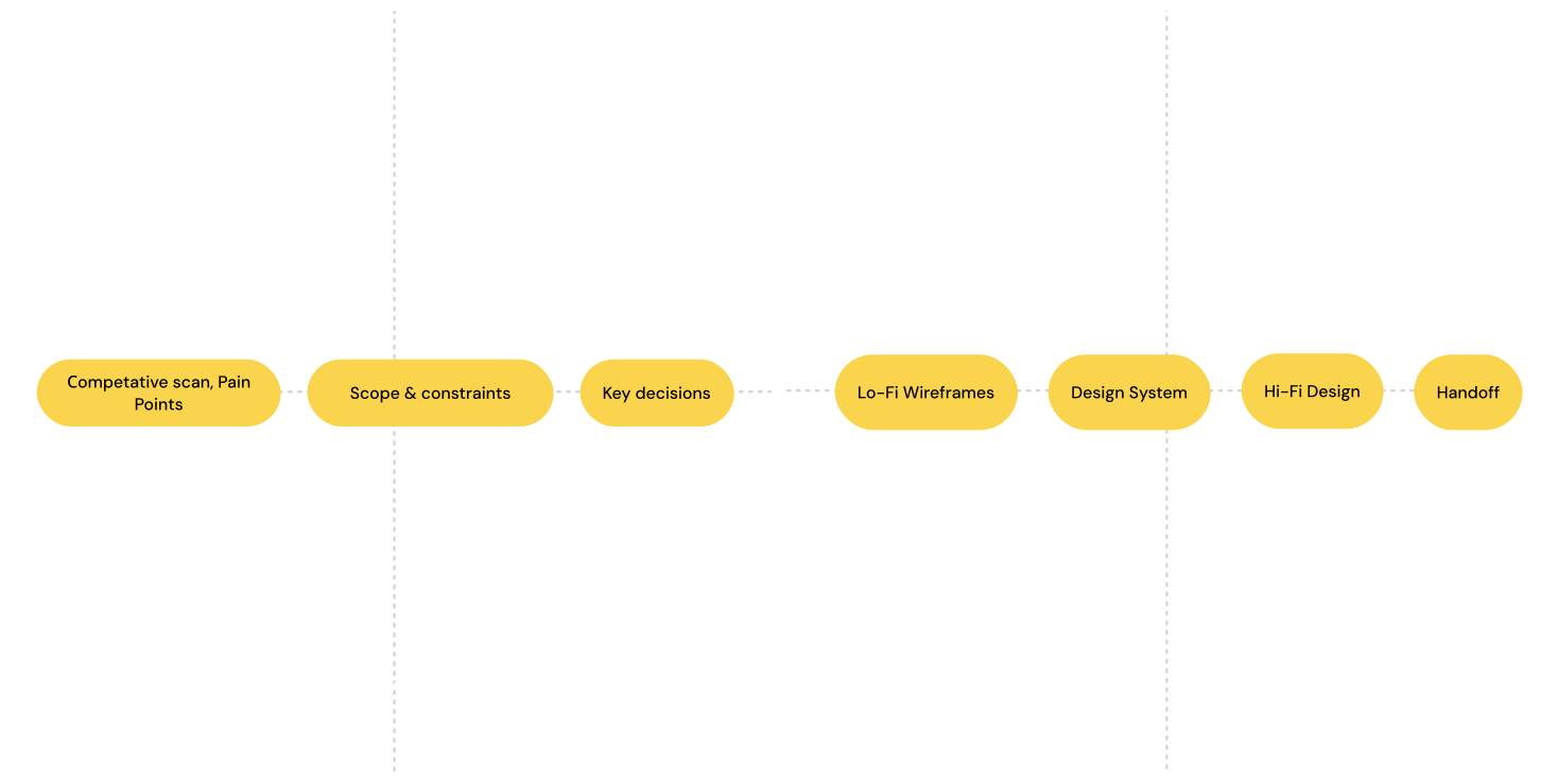
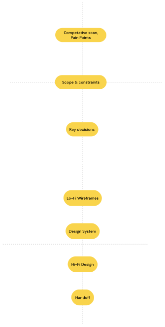
I used a simplified Double Diamond to structure decision-making within a small, time-boxed scope. The framework helped balance exploration and focus: first identifying the core problem space, then converging on a clear, content-first solution without over-designing secondary features
The scope was limited to essential reading flows to validate a clear and scalable content-first experience.

These principles guided key layout, typography, and component decisions across all core screens, from homepage to article pages.
UI elements exist to serve the story, not compete with it. Navigation, ads, and widgets stay out of the reader's way.
Type size, weight, and color create clear reading paths — users always know what's most important at a glance.
Every article is represented by a flexible card component that adapts from breaking-news hero to compact list item.
News readers expect lots of content — but whitespace and rhythm make high density feel comfortable, not chaotic.
The same reading experience works on a 27" monitor and a 375px phone — layout shifts, quality doesn't.
Skeleton screens, lazy loading, and optimistic UI make the experience feel instant even on slow connections.
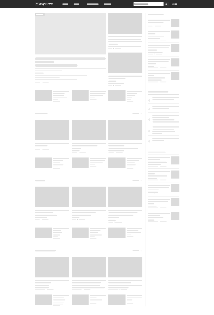
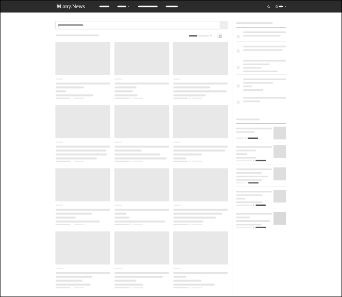
Wireframes focused on content density, hierarchy, and reading flow before visual styling



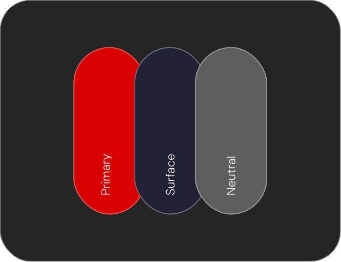
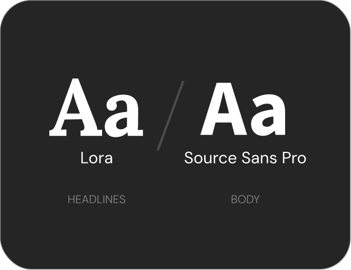
A minimal visual system built for reading, clarity, and real UI use




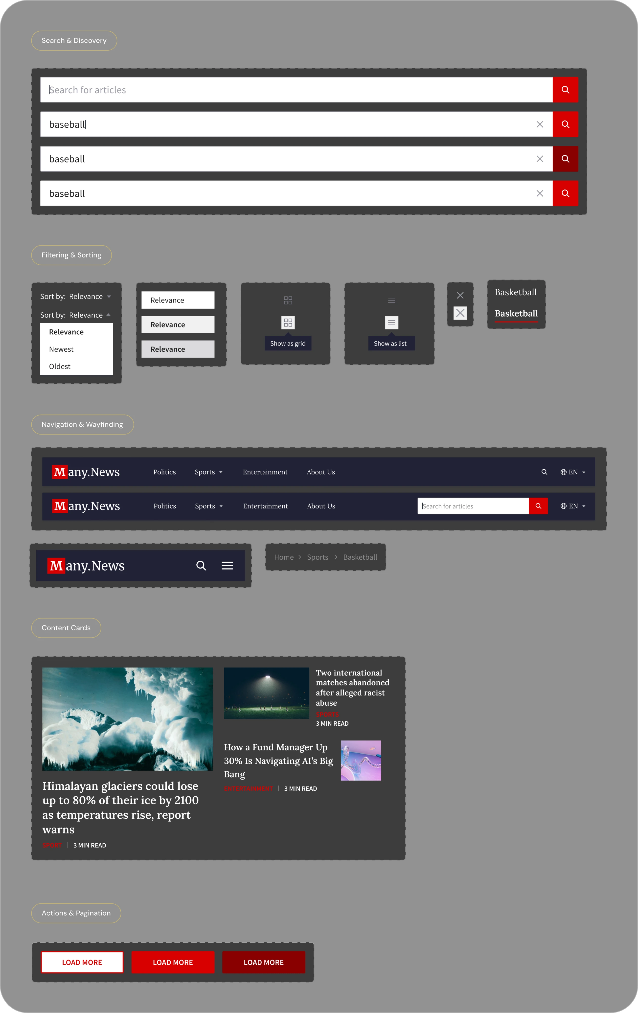
The project resulted in a clear, content-first news experience optimized for both scanning and long-form reading. A consistent component system and focused scope helped translate research insights into a scalable UI foundation that can support future content growth and feature expansion.
4.8★
Avg. usability test rating
−40%
Time to find target article
100%
Task completion rate
+3 min
Avg. session duration vs. benchmarks

Designing a card system first — before full page layouts — made the entire UI more consistent and easier to scale.
News users scan before they read: investing in headline typography and thumbnail contrast had the biggest usability payoff.
Dark mode wasn't a "nice to have" — it was the most requested feature in early user interviews and significantly improved evening session engagement.
Balancing information density with whitespace is an ongoing editorial decision, not a one-time design choice.
Testing with real news content (not Lorem Ipsum) early revealed hierarchy problems that clean placeholder text would have hidden.