
vpnMentor PPC Page Redesign
Optimizing the landing experience for higher conversion through a complete redesign focused on clarity and trust.
Overview
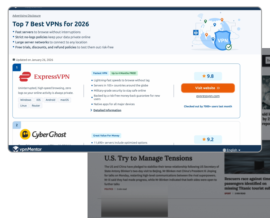
vpnMentor is a VPN comparison platform with a large share of traffic coming from Google Ads. This PPC landing page is the entry point for high-intent users who want to decide quickly. I redesigned the first-screen experience to make the top recommendation and the next step (provider click) immediately clear across mobile and desktop.
Goal
I focused on increasing provider click-through by making the #1 pick, rating, and primary CTA obvious on first view. Success meant fewer scrolls before the first click and a faster path to a provider page.


Problem
The page attracted high-intent users, but the layout didn't support fast action. Key decision signals—rank, rating, trust cues, and the primary CTA—were pushed down, while secondary content took the most valuable above-the-fold space.
As a result, the page felt slower to scan and easier to abandon before clicking.
Decision signals are easy to miss
The #1 pick and CTA aren't immediate on first view

Impact: Users bounce between options
Weak above-the-fold hierarchy



CTA lacks emphasis
Comparison takes effort
The comparison row structure buries key differentiators in a horizontal scroll, making evaluation slow.
Impact: Users drop off before comparing options
Requires extra steps to compare

Comparison creates memory load
Desktop snapshot: same template friction
On desktop, the hero takes up the first screen, so the ranked list and CTA don't feel 'next' right away.
Impact: People spend the first screen reading, not deciding
Reading-heavy hero


CTA not immediate
Competitive Benchmarking
- Competitors surface more options above the fold: faster first click.
- Winning layouts place trust cues right next to the CTA, at the moment of commitment
- Clear chunking turns comparison into a quick scan instead of a reading task
User motivation & context
Design Principles
To turn the research findings and competitor patterns into clear layout decisions, I followed three decision-first principles. They guided what users should notice first, what helps them feel confident at the click moment, and how the page can support fast comparison.
Surface #1 instantly
Make the #1 recommendation visible on first view, so users immediately understand the best option and the next step.
Build trust at the click
Bring ratings, proof cues, and key benefits closer to the primary CTA to reduce hesitation right before click-through.
Make comparison scannable
Organize provider cards into clear sections with short highlights and labels, so users can compare options quickly without reading long blocks of text.
Wireframes
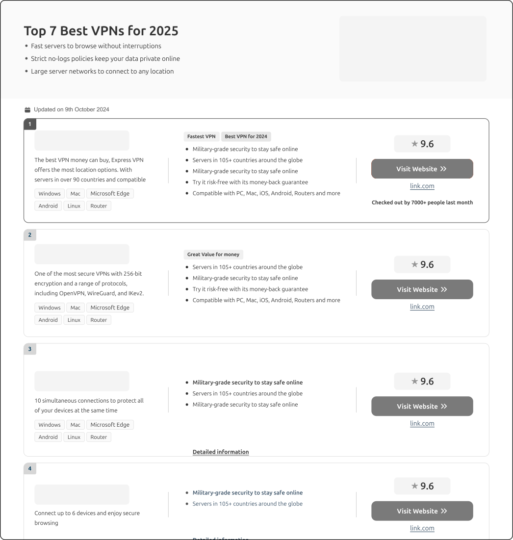
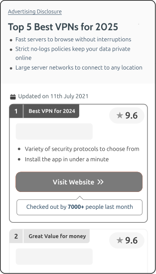
I explored layouts to validate decision-first hierarchy, trust near CTA, and scannable comparison across mobile and desktop.
.svg)
- More providers visible per screen for faster scanning.
- Less reading-heavy hero space so recommendations appear sooner.
- Clear labels + consistent CTAs to support quick choice.
Solution
I redesigned the page around a single goal: help high-intent users choose a provider and click through with confidence. I applied a decision-first hierarchy across mobile and desktop, keeping the key decision signals close to the action.
- Comparison-first layout: key differences visible side-by-side (less switching / memory load)
- Consistent card structure reduces re-reading
- Wider spacing + chunking to reduce "dense" reading and highlight the winner faster
- Trust cues placed next to the CTA at the click moment


- #1 pick + rating + CTA visible on the first screen
- More cards per screen (reduced hero / less "reading-heavy" space)
- Short highlights instead of paragraphs
- Trust cues placed next to the CTA at the click moment
- Subtle CTA motion to guide attention
Impact
The redesign clarified the decision path from the first screen—users could identify the top recommendation faster, compare options with less effort, and feel more confident clicking through thanks to trust cues placed next to the CTA.
A/B test outcome: The redesigned experience outperformed the original on the primary goal (provider click-through), so it was rolled out as the new default.
+38%
Conversion rate increase
−52%
Bounce rate reduction
+4.2s
Avg. time on page
91%
Positive user feedback

Key Takeaways
Users don’t need more information — they need faster decisions.
Grouping the top pick, trust cues, and CTA into one clear area made the next step obvious.
Trust signals were most effective when placed right at the moment of action.
A consistent card structure turned comparison into a quick scan instead of a reading task.
On desktop, extra space worked best when it reduced effort — showing more options and aligning key signals rather than adding noise.